Making the Data Make Sense
Online Image is a Utah SEO and internet marketing agency serving small businesses, affiliate marketers, and national franchise operators. Their marketing promised clients "clear, concise results" — performance data that was easy to understand. Stats, their reporting product, wasn't delivering on that promise.
The Problem
Stats surfaced the metrics clients cared about — visitors, bounce rate, time on page, keyword rankings, and, for franchise clients, performance broken out across dozens of locations. The data was there. The product had been built by programmers, and it showed.
Screens were dense: every metric that could be displayed was displayed, with no hierarchy to tell a user which numbers mattered most. Comparison was the core job clients came to do — this month against last, this location against that one — and the product handed them static tables to do it in. Nothing explained what any number meant: no trend, no benchmark, no signal of whether it was good news.
The commercial consequence was direct. Stats was meant to be a reason to sign with Online Image. In practice, prospects looked at it and saw work.
4,213
61%
1:42
318
14.2
988
▾ Select… [GO]
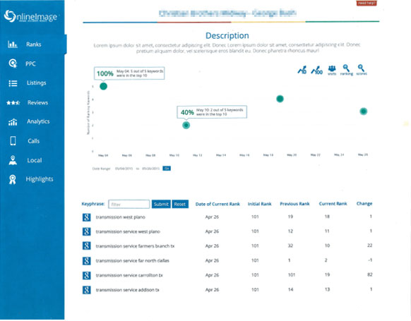
Recreations, not screenshots — the original Stats screens were never archived. Rebuilt from memory to show the specific problems the redesign addressed; data shown is illustrative.
How We Worked
The redesign was a two-person collaboration with Sonya, the engineer building the product in D3. We worked screen by screen: I'd print a screen and sketch over it — not just restyling what was there, but asking a prior question: what is a user actually trying to learn here, and which of these numbers serve that? A lot of the work was subtraction. Metrics that didn't earn their place came off the screen, and what remained got room to breathe and a clear hierarchy.
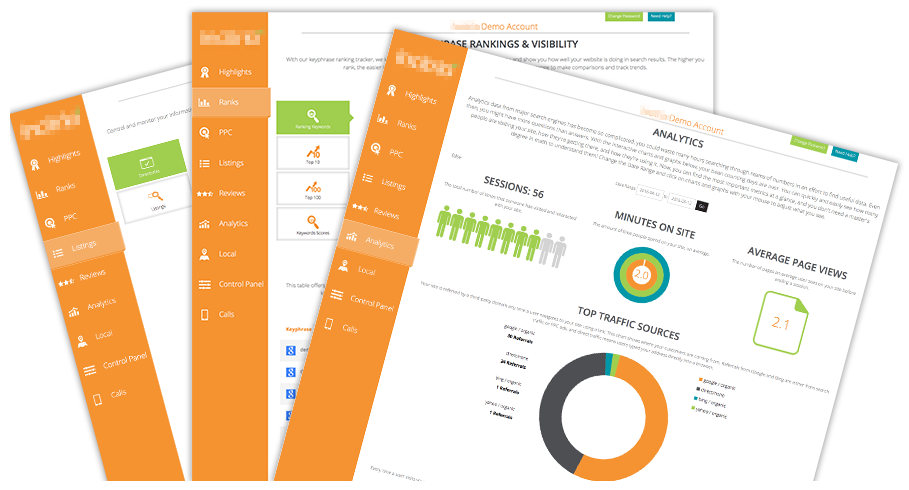
Stats wasn't one dashboard — it was white-labeled per client, each one skinned with that client's own logo and brand colors. Every layout and chart had to be designed as a system that could carry any client's palette without breaking the visual hierarchy we'd just fought to create, not a one-off look tuned to a single brand.
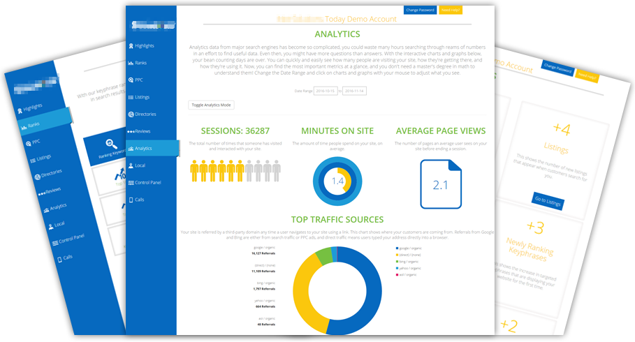
A static table comparing two datasets became a line-and-dot chart that put them side by side, with hoverable points revealing exact values on demand — the shape of the trend legible at a glance, precision one hover away instead of crowding the view. Charts animated on entry, drawing the eye along the trend rather than dropping a finished image on the page.
Sonya assessed each proposal against what D3 could actually do. Feasible, she built it. Not feasible, she told me why, and I reworked the design inside those constraints — several times, the reworked version landed better than my original sketch, because the limitation forced a simpler idea, and simpler was what the product needed. Designing against a live feasibility check meant no time spent on comps that could never ship, and constraints arrived early enough to be design inputs rather than late-stage compromises.
The franchise-comparison screen was the hardest problem in the product, and the one where that loop mattered most: giving an operator running dozens of locations a way to see the whole system at a glance, not one location behind a dropdown at a time.
The Result
We went section by section through the whole product this way. Following the redesign, Stats became profitable for the first time in its history — the product Online Image had built to be a reason to sign with them finally was one.